Semitra Exhibtion
tFont/fTime
work
“tFont/fTime” works(new work / commissioned by YCAM)
01. Movable Type (StudioB) *
02. Typesetting (StudioB) *
03. California Job Case (StudioB) *
04. No Flash Photography Allowed (StudioB) *
05. LCD/CRT (Foyer) *
06. No Flash Photography Allowed - projection (Foyer) *
07. Large Scaled Sign - LED (Foyer)
08. Large Scaled Sign - Sculpture (Central Park)
09. "tFont" Installative Photographs (Gallery second floor)
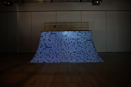
10. Large Projection from Studio B (Gallery second floor)*
11. Semitransparent Design's activities for Commercial Works (BIT THINGS)
12. Terminals for Access on the Web (BIT THINGS)
*These works are linked each other and shared visual deterioration system on typeface by central server.
Exhibited Works
01. Movable Type
A font that can be played like music
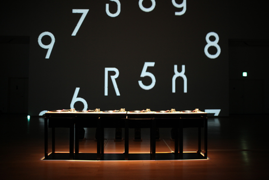
Six turntables are set up in the exhibition space. Playing records on them triggers displays of letters from A to Z in alphabetical sequence on a screen in the front. By operating the turntable in a DJ-like “scratching” fashion, the visitor can change (distort) the shapes of the letters, and enjoy the resulting combinations of visuals and sounds demonstrating how this font design happens on a directionally manipulable time axis just like music or a movie.
At the same time, the letters gradually decompose during their repeated “playback” throughout the Center’s opening hours. While the operation of the turntables results in a “distortion” that highlights a momentary relationship between the body and letters, the additional time axis introduced via the server causes further “decomposition”. In this work, actual time as manipulated by the visitor overlaps with the notion of time added by the media, to produce a composite time axis that represents a new type of “fontscape”.
02. Typesetting
Messages supplied via the Internet are displayed in the “tFont”
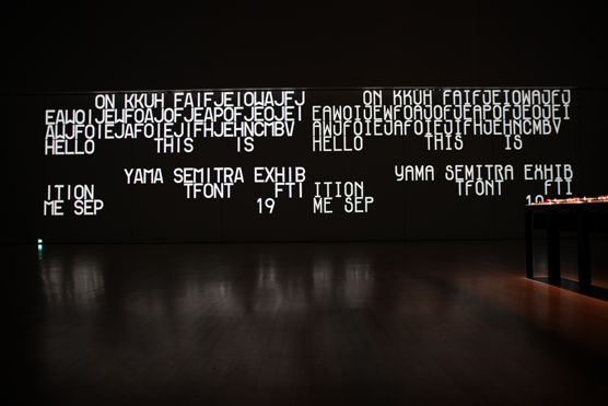
Text supplied via a special website or email address is displayed in the font that is concurrently designed in “Movable Type” (see above). In other words, this work synchronizes the timing of message posts to the website with the constantly updated data of the font’s decomposition inside the exhibition space, in order to make participants' messages visible. Real-time footage of this process is streamed on the Internet, allowing those who posted messages to witness the decomposition process of their own letters in the physical exhibition space. The synchronized timelines interlinking the venue and the Internet, visitors and exterior participants, overlap with the aspect of time introduced through the media used, while the typeface’s appearance keeps changing. The work as a whole can be interpreted as a visualization of the unique sensation of time in today's information society, along with the exchange of messages between an unspecified group of users.
03. California Job Case
Overlooking the transformation process of the original “tFont”
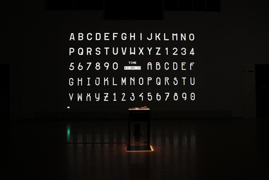
In this work, the visitor can observe the decomposition process of a font on a projected chart of letters (A-Z) and numbers (0-9). Manipulating the playback speed with a turntable results in a layering of multiple time axes that cause the typeface to change its appearance by the minute. The chart – in a sense a list of samples of the “tFont” – demonstrates on 33 examples how letters gradually transform into a distinctive font.
04. No Flash Photography Allowed
Messages that only become visible when photographed
Countless blinking dots of light representing text messages supplied via the exhibition’s special website or email are being displayed on a screen in the original “tFont”. The viewer can only read these messages by photographing the dots of lights and adding a temporal aspect to create an “animation”. With an exposure time that is different to that of the human eye, the camera captures what seems like nothing but an accumulation of blinking lights, and reveals readable text information. The operation (photographing) of a third party as a subsequent creative/communicative element suggests an alternative form of creativity that, inspired by the unique sensitivity of skating and street culture, generates new scenarios in urban settings. This is the foundation the members of Semitra base their interpretation of the unique aspects of perception and speed in web design upon.
05. LCD/CRT
Experience a font that changes its appearance through media
This installation consists of a total of ten monitors (composed of both LCD and CRT) that display a font designed in “fTime”. Here the decomposition process is demonstrated on single letters extracted from “fTime” (which is continuously updated at the exhibition space and via the Internet), appearing in random order and with varying speed on monitors with different reproduction systems and resolution. The work is a symbolic hint at the emerging various relationships between typeface, time and output media.
07/08. Neon and other signs shaped like the exhibition’s key letters
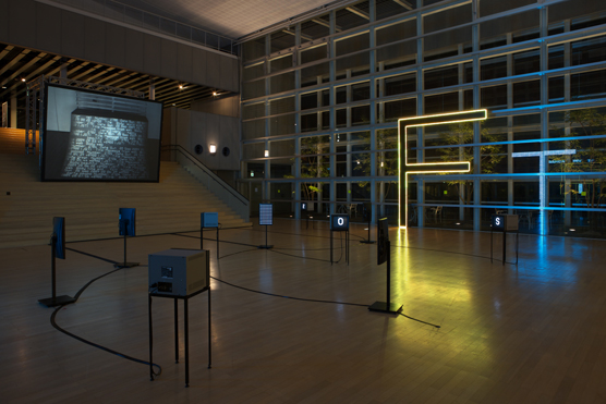
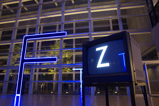
Large-sized displays in the shapes of the exhibition's key letters “T” (time) and “F” (font) are installed in the foyer. These T- and F-shaped objects are made of moving LEDs that change colors each time a message is posted via the exhibition's website. More huge Ts and Fs are placed in the Chuo Park, serving as benches among others. Visitors can enjoy the daily changing “fontscapes” of letters blending into the environment of the YCAM building and its surroundings.
12. Website for message posts and real-time images from the exhibition
website http://www.semitraexhibition.com/
During the exhibition period, this special website can be used at any time to access the venue. Users who post messages can witness by way of real-time footage how the text they supplied is being displayed in a gradually transforming font.