In the "minimum interface" exhibition, navigation design in the sense of a meta-interface for the displays is functioning as a clue for establishing a new kind of relationship between the artwork and the viewer. Against the backdrop of today’s jungle of different, sometimes competing media, the exhibition aims to reconsider the sensual quality and presence of paper as a primary medium, and implement the latest information technologies to explore new possibilities of navigation.
"on the fly"
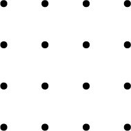
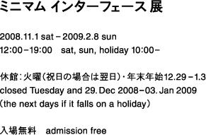
The flyer for this event carries only minimal textual information, so in its function as a navigation tool, the flyer itself is designed as one "minimum interface". The flyer has 16 holes, and is placed on navigation tables at three different points in the exhibition space. By covering the holes, the visitor can access information about the exhibition and the artwork represented by the respective, covered hole. We called this system "on the fly", and equipped with high-precision shape detection technology, it allows the visitor to enjoy the interaction triggering the display of information regardless of the flyer’s position on the table.
navigation design: LEADING EDGE DESIGN
graphic desifn: good design company


